Bright is an online learning platform that makes educational resources and content videos specifically tailored to complement the Vietnamese-English curriculum.
By definition, the word 'Bright' is often associated with intelligence and wit. Likewise, it was no coincidence that Bright got its name; The core belief behind Bright is that every student should have easy access to affordable quality education, allowing them more opportunities to thrive in their futures.
Essentially, Bright's resources are created for 10th-grade students, with the plan of creating resources for 11th and 12th graders as the brand and platforms grow.
Bright wanted a unique brand that placed an emphasis on a student-centric approach. Bright understands that the best learning is done when teachers and students are having fun so they wanted a brand that embodies this.
There are four sacred animals in Vietnamese culture, one of them being the tortoise. The tortoise represents longevity, education, and wisdom. A giant tortoise made from marble in 1675 can be found at Thien Mu pagoda in Hue City. It is said that the students within the proximity of the area often gather around the pagoda before exams to touch the tortoise's head to bring them good luck.
The tortoise is, therefore, the most relevant animal with regards to education in Vietnamese culture, and is a symbol that is understood by all students, parents, teachers, and schools.
This insight was the driving force behind the creation of Bright's logo. Not only is it very culturally appropriate, but it also allows us to personify the brand, making it more relatable to the target audience.
Brand essence is the core value of a brand that guides all business and design decisions.
For Bright, the brand essence is to provide educational resources to help the students thrive. This brand essence, which was intended for internal use, was then simplified into the slogan of:
Helping students grow.
This was done to ensure that the slogan could easily be translated into Vietnamese and that it would be understood by everyone in both languages.

When crafting the brand strategy, a lot of research was done on the concept of gamification and how it could be used to increase motivation and engagement. Due to the nature of Bright's online learning platform, motivation and engagement are essential to the success of its users. While keeping fun and creativity at the forefront of our minds, we ensured that the overall branding and messaging embodied the concepts of gamification.
We also spent a lot of time looking at other online learning platforms and analyzing what made them successful. From this competitor analysis, we were able to position Bright differently from its competitors, ensuring that it stands out—whilst learning key considerations along the way. When (if) competitors or similar concepts exist, we can leverage accelerated market research opportunities, giving a new brand a head start on potential hurdles along the way.
Due to the fact that Bright's resources are specifically made to compliment the Vietnamese curriculum and are targeted towards Vietnamese schools, teachers, students, and parents, we took the time to learn more about the Vietnamese culture, its symbolism, and what makes it unique. It helped us establish a brand that instantly resonates with the target audience on a deeper level.

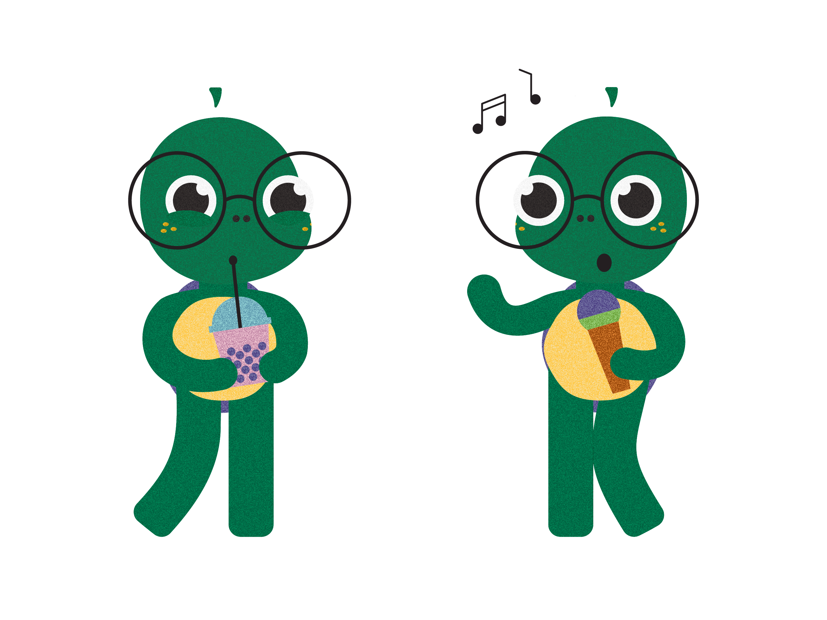
The logo offered an obvious opportunity to create a brand mascot. By developing the tortoise, we were able to give the target audience a character to love, trust, and incorporate into their everyday lives.
To make the brand stand out we choose bold, bright colors paired with a grain texture to give the brand a memorable and iconic look and feel. The brand character was then illustrated doing activities that Vietnamese students often partake in and enjoy doing, making the character relatable.

All brand roll-out items that are intended for the students were designed with the student's enjoyment as the main focus.
Various facial expressions were also created, allowing the brand to communicate with its target audience in a more personal and playful manner. These facial expressions are used for notifications and progress reports, both on and off the platform, including social media.

Having a primarily illustrated brand will also mean that Bright can create new and exciting illustrations on a yearly basis, ensuring that the brand continues to grow with its target audience. With a solid visual presence, the brand will be able to adapt to trends and current affairs to keep relevance whilst building an impactful voice for the desired target market.


One of the main challenges of this project was ensuring that the logo mark looked like a tortoise (and not a frog). This was done by adding tortoise-like nostrils and spectacles to the logo mark.
Another challenge was developing the brand character in such a way that it would appeal to high school students and wouldn't seem too childish. In the end, longer legs, a shorter torso, big eyes, and big glasses preserved the desired 'cuteness factor' whilst making the design age-appropriate; Elements of the design were tweaked to ensure the character looked akin to the target market.


As a human-centered design agency, our approach is always relational over transactional. We believe that the key to delivering high-impact and high-quality work stems from meaningful work, which is beyond simply supplying a demand but also build impactful relationships with our clients.
When Bright approached us with its vision of a student-centric approach, we knew right away that this project resonates with our mission. At Mäd, we highly believe in the power of giving back. Earlier this year, we have partnered with Stripe Climate in contribution to remove carbon from the atmosphere.
This time, we are collaborating with Bright in promoting accessible education by offering an academic experience that enables them to thrive and perform well in schools.
By collaborating with Bright we delighted in aiding the promotion and facilitation of accessible education for all. With the brand geared towards using modern digital technologies to engage and inspire upcoming generations, this aligned with our forward-thinking and continuous growth principles. Design agencies and consultancies may be vast in numbers across any given city, which is why we advocate for finding harmonious partnerships—i.e. working with people that share your passions, visions, and general 'culture fit' thinking.


As a final thought, we can reflect on the benefit of our agency being multi-disciplinary. A talented artist may design both aesthetically beautiful and thoughtfully reflective of the brand's a product/service or approaches, but being able to pair with (and share ideas with) UX, web, and MarComms professionals from concept conception through to final executions allows for additional layers of strategy. For example, giving a brand an image should be paired with giving them a voice, mapping out the key direction to communicate effectively and consistently on-brand. Taking time to consider how the brand identity will fit into full corporate roll-outs and digital applications is incredibly useful when designing.
Is your brand future-proof?
Work with our expert team to transform your business and exceed objectives.
Together we can Make It Happen.™


